National Institute on Drug Abuse Modernization
A Modern Design System for Accessibility & Growth
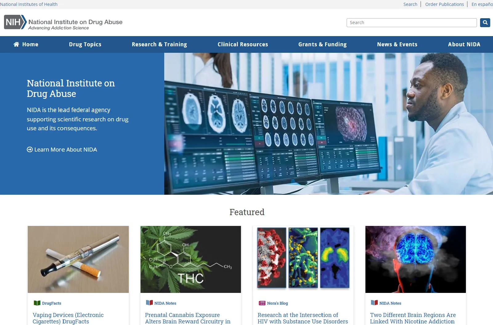
The National Institute on Drug Abuse (NIDA) website was a vital public health resource, but years of continuous growth had resulted in a complex digital environment. Its structure, built over time to meet evolving needs, had become challenging for users to navigate. The design, while functional, was a collection of different styles and components, which impacted visual consistency across the site. The site’s navigation and content organization, though well-intentioned, no longer supported the user journey as effectively as they could. For researchers and members of the public, locating specific information could be a time-consuming process. My mission as the sole UX Lead was to work with our dedicated team to bring a new level of clarity and usability to this essential platform.
Key Challenge
The site's content and design had grown into a complex, inconsistent system that made it difficult for users to find the information they needed.

My Role
As UX Lead, I guided a small, cross-functional team to modernize the website and create a more user-friendly experience.
A System-First Approach to a Content Problem
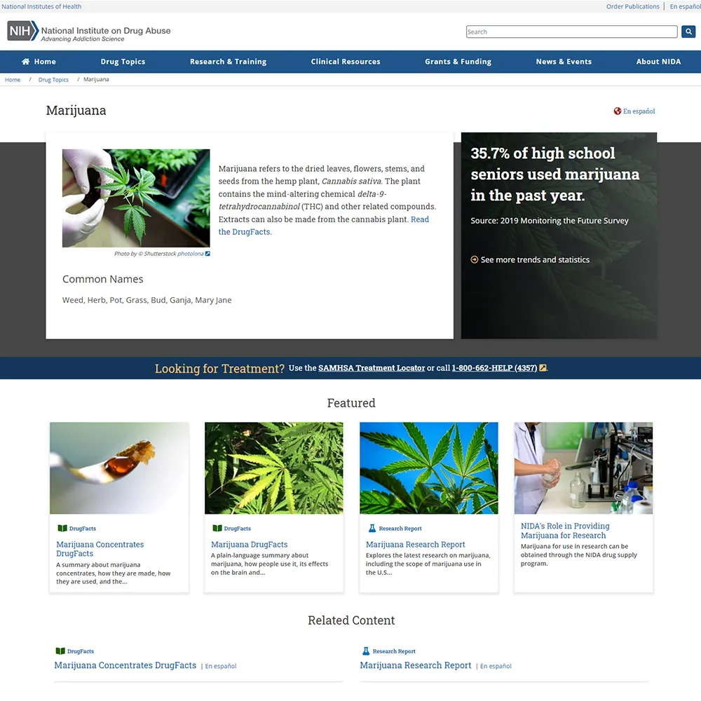
Our project began with a deep analysis of the existing content and user behaviors. We found that key publications, such as NIDA Notes and Research Reports, were in separate silos, which made it difficult for users to access all of NIDA's information on a specific topic in one place.
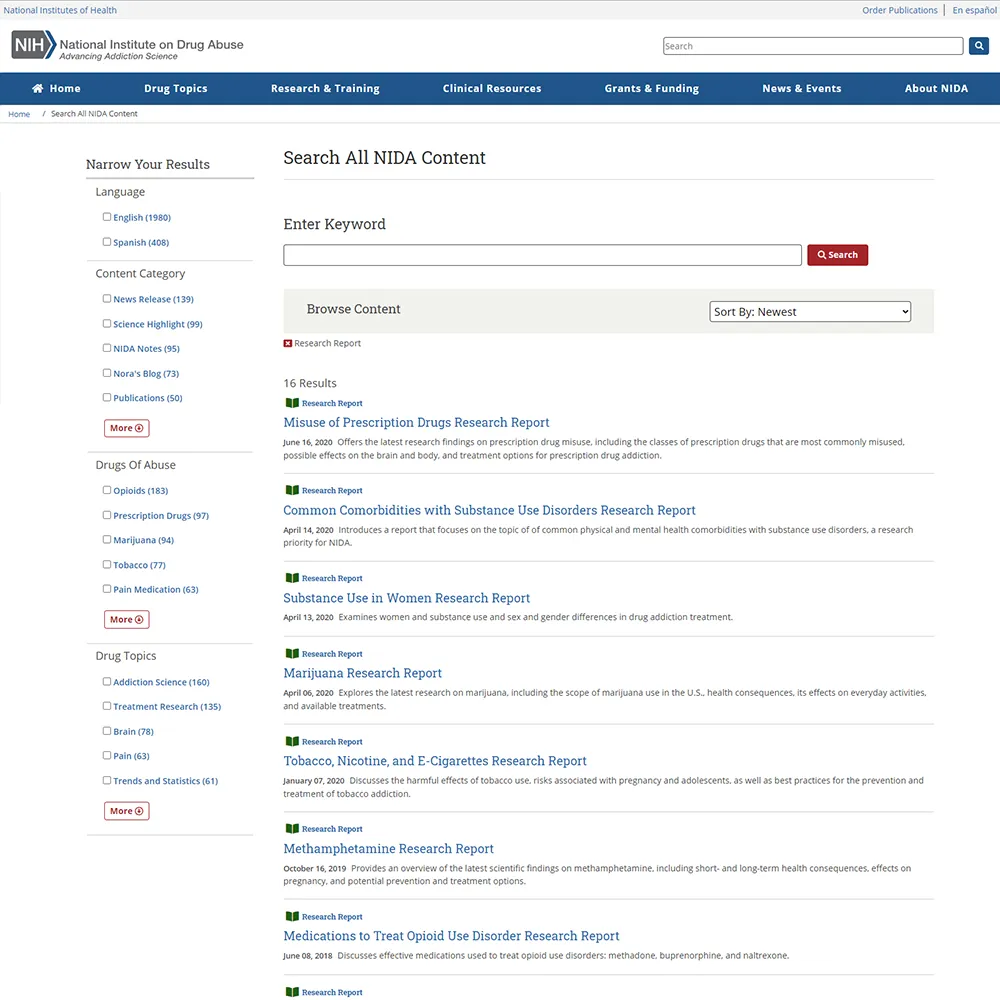
This insight drove our core strategy: to consolidate information into topic-based hubs. We implemented a new taxonomy and designed a faceted search tool that empowered users to easily filter and find all related content—from articles and videos to infographics—regardless of its original publication.
Content Strategy
We consolidated content into unified topic hubs and created a powerful faceted search to improve findability.
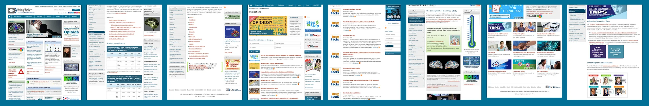
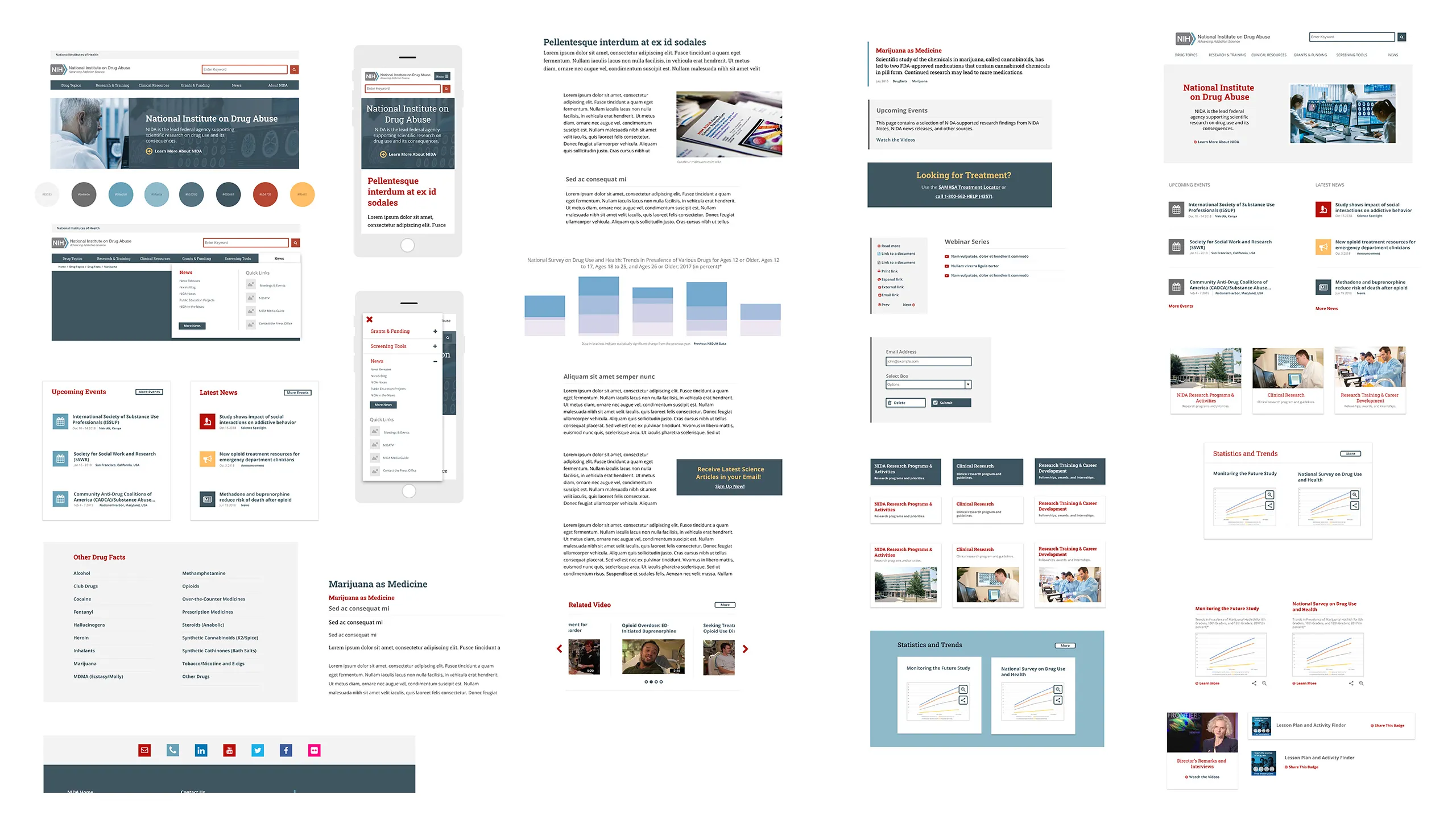
UI Inventory of the Old Website
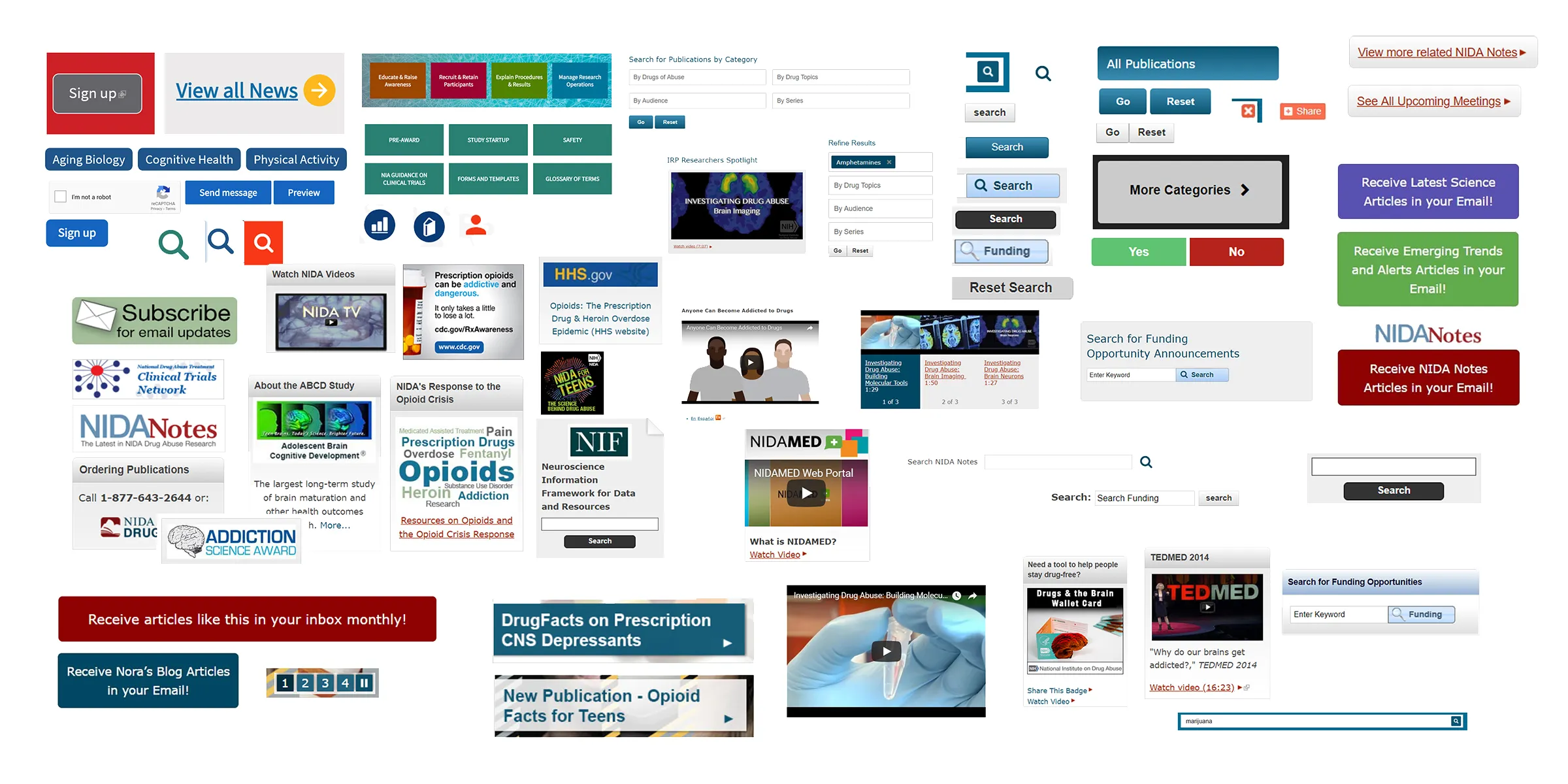
In parallel with this content restructuring, I led a comprehensive UI inventory. This process helped us identify and understand the various design components that had accumulated over the years.
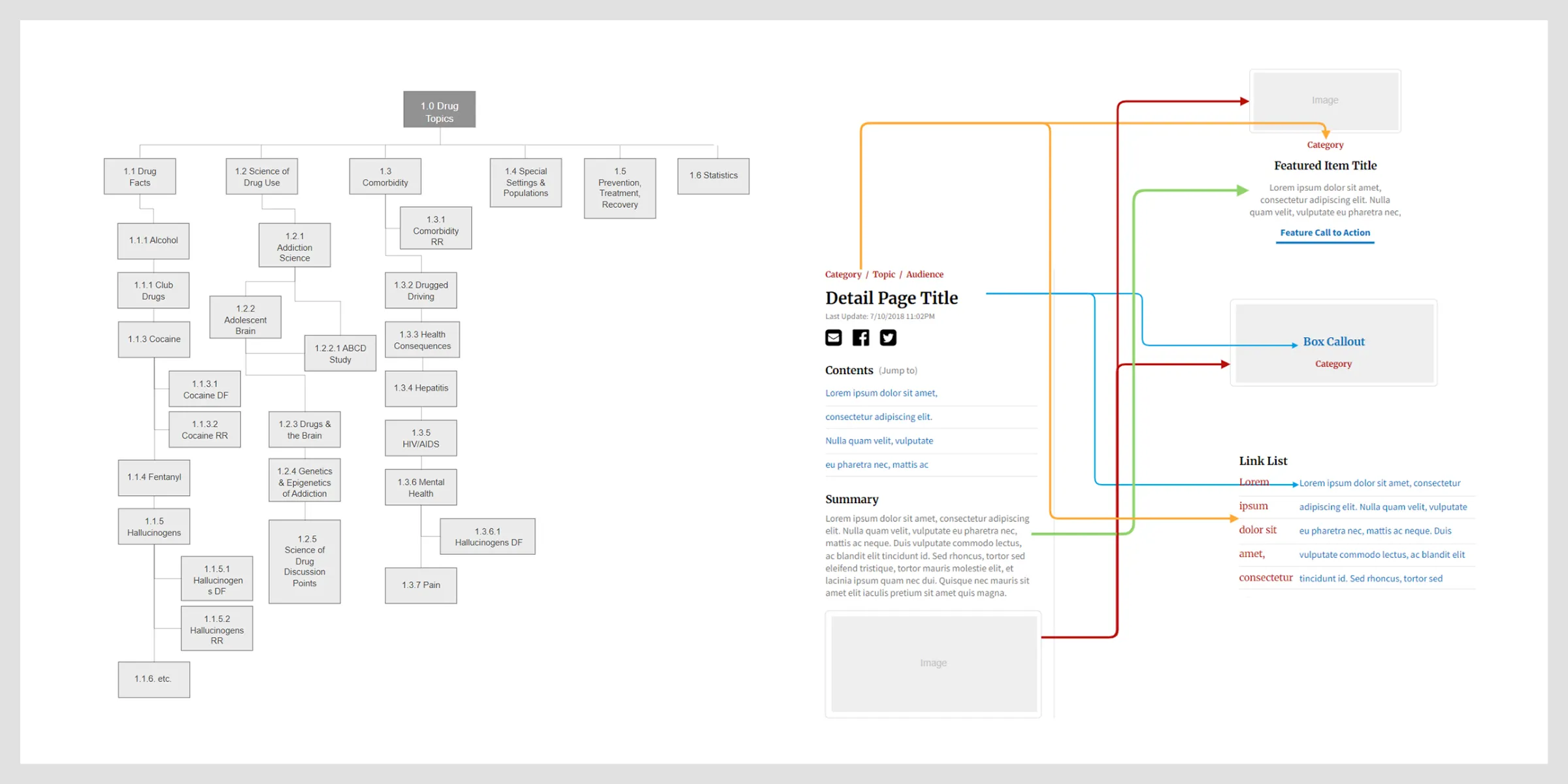
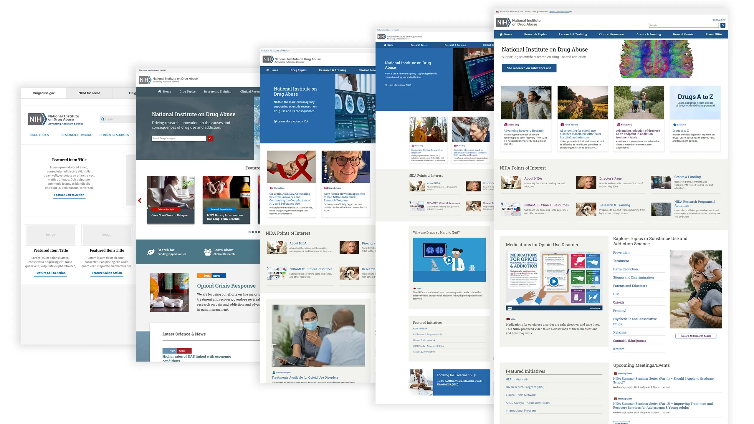
Design Solution Using Atomic Design Principles
To solve for this, I spearheaded the creation of a comprehensive UI pattern library based on atomic design principles. This allowed us to unify the visual language of the site and create a flexible system of reusable components, ensuring a consistent and logical experience for users.
Results
Our approach was built on close collaboration with the NIDA team. We conducted frequent progress meetings, showing them work in real-time and gathering their valuable feedback. This transparent process helped us build a strong partnership and ensured that the final design was one everyone felt proud of.
The project had an immediate positive impact.
Traffic
The redesigned site saw an overall traffic increase of over 3%(~120,000 users).
Engagement
Conversion Rate for Eblast Subscribers increased by 127%
Performance
The site's performance metrics improved significantly, with a 30% reduction in server response time.
Positive Stakeholder Feedback
"Can I give your team a standing ovation over the phone for the website launch? We are so pleased with the site, how fast it is, the design. I have heard nothing but positive feedback from people at NIDA. Some folks even recognized that it looked like a lot of hard work went into the project!
The site is beautiful and everyone is super excited. Thank you for all your efforts getting us to this new digital day."
The Enduring Value of a Design System
This project was a powerful demonstration of how a strategic, system-first approach can transform a complex digital platform into an efficient, user-centric, and sustainable resource. We delivered a "future-proof" website that the NIDA team could easily maintain and expand upon, thanks to a comprehensive knowledge base and a flexible design system.
Long-Term Impact
The new design system and content strategy laid the foundation for future site growth and maintenance.
Personal Growth
The project solidified my belief in the power of design systems and the importance of bridging the gap between design and development.
What We Built
- Improved primary navigation, breadcrumbs, and pagination for better user flow.
- Leveraged Font Awesome for a modern, scalable icon library.
- Standardized icon colors, sizes, and alignment for a cohesive look.
- Developed a consistent button system (primary, secondary, progress indicators).
- Unified form elements (inputs, checkboxes, select menus) for accessibility and usability.
- Defined single styles for tabs and tooltips to maintain uniformity.
- Improved expand/collapse panels for better content organization.
- Enhanced media integration (YouTube embeds, audio players) with clear time/size indicators.
- Created modular content blocks for articles, research highlights, and announcements.
- Implemented featured sections (hero banners, blog highlights, publication showcases).
- Ensured consistent typography (h1-h6 headings) for readability.
- Improved list structures (unordered, ordered, definition lists) for better content hierarchy.
- Optimized third-party integrations (Search.gov, social buttons, RSS feeds).
Case Studies
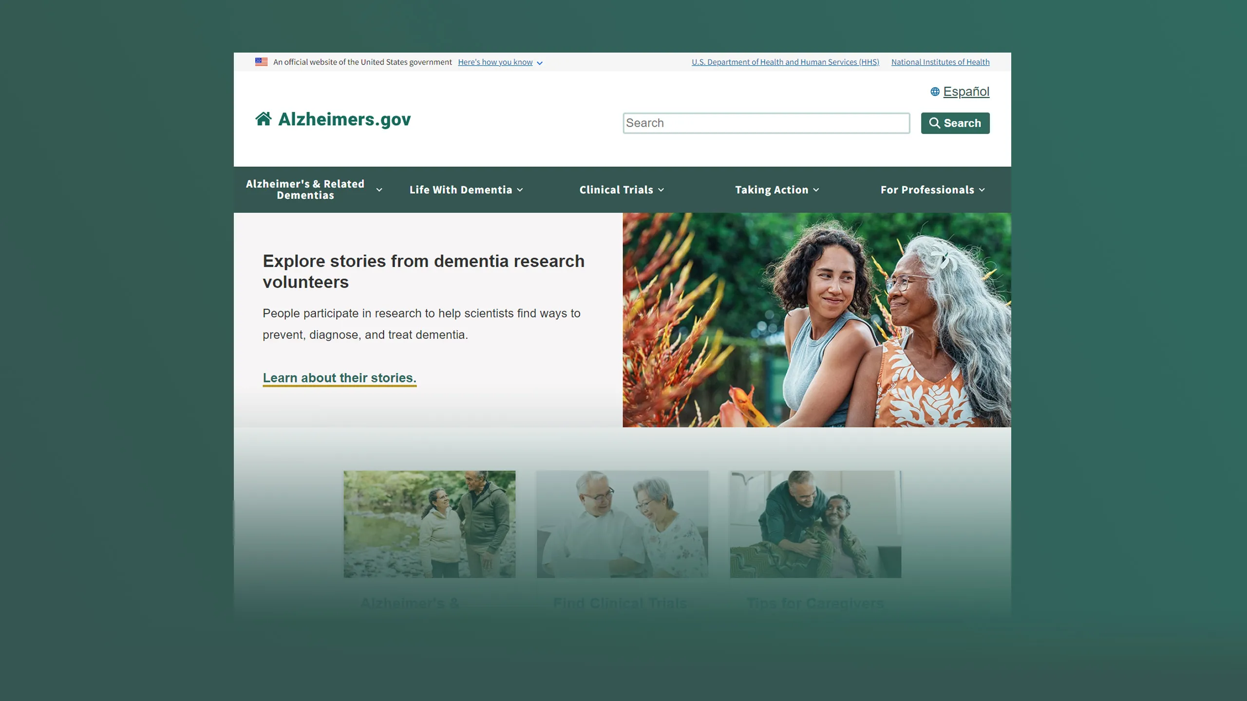
Alzheimers.gov
Designed Alzheimer's.gov to improve clarity, accessibility, and user flow for patients and caregivers.
Read Case Study →
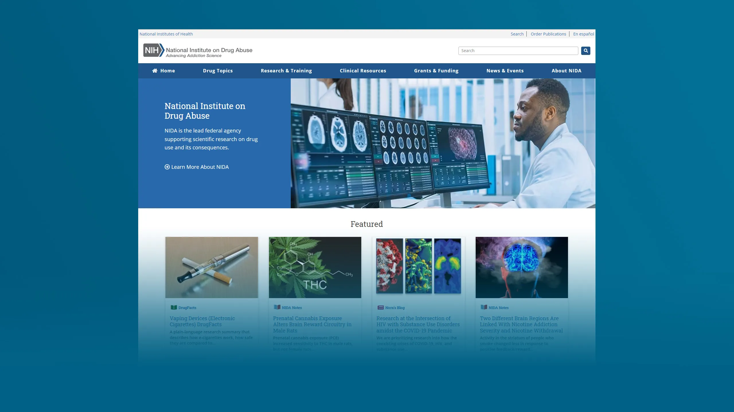
National Institute on Drug Abuse Modernization
A comprehensive redesign and Drupal 8 migration, transformed The National Institute on Drug Abuse site.
Read Case Study →
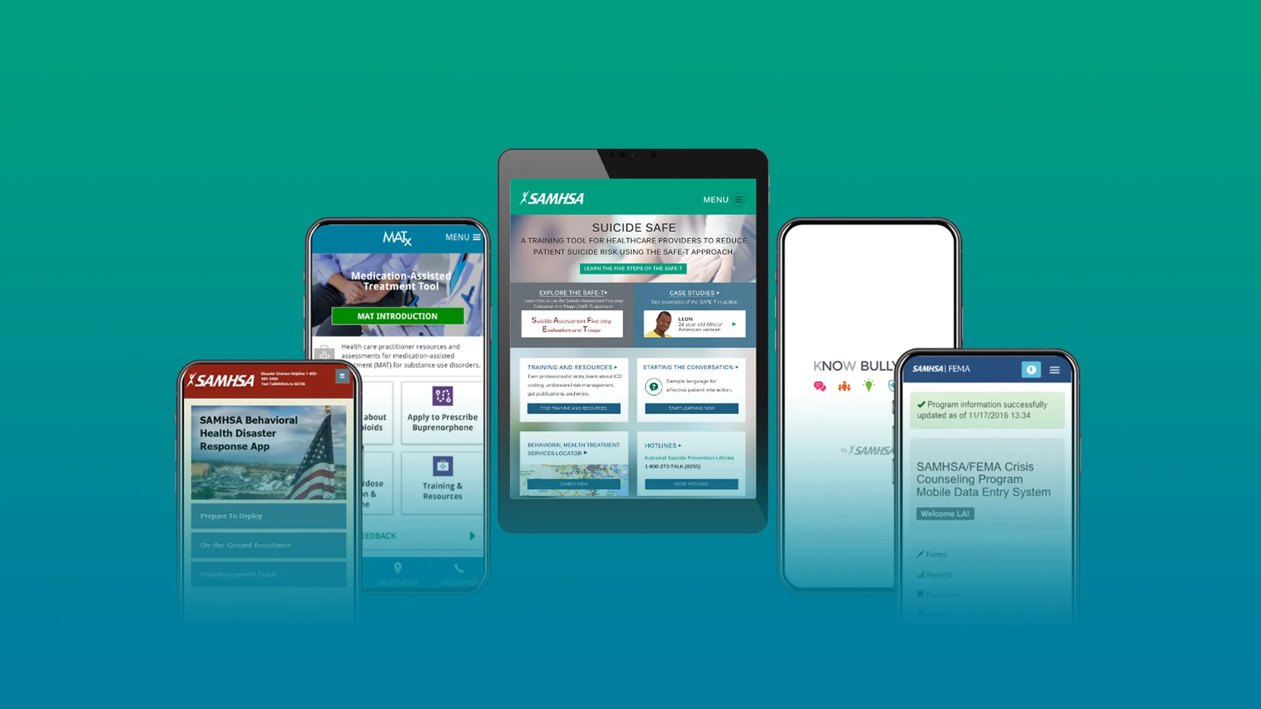
Designing Calm in the Chaos
Created intuitive mobile experiences to support users during public health emergencies.
Read Case Study →
Get Started
Let’s Build Something Exceptional Together.
Whether you need strategic UX leadership, hands-on design, or comprehensive digital transformation, I’m ready to help you achieve your goals.